Here's an illuminating figure from the 2018 paper

Sonya Norris, Legal and Social Affairs Division, 2018-02-14
Figure 5 - Deceased Organ Donor Rates (per million population), Consent Regimes and Number of Donors in Selected Countries, 2015
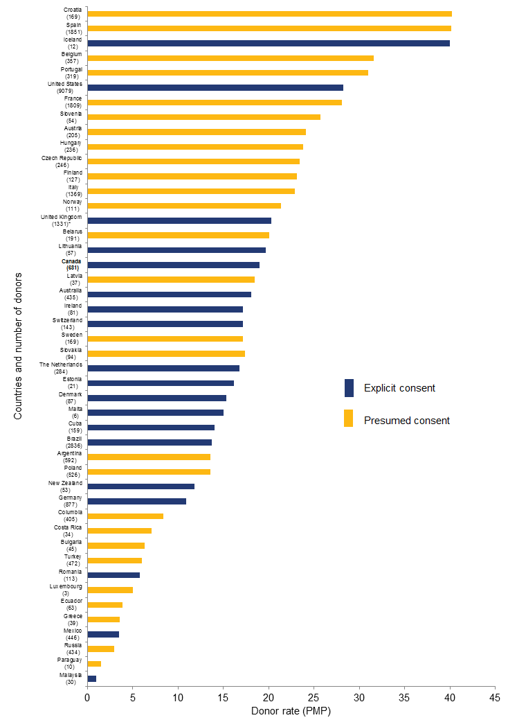
Presumed consent (opt-out) countries are graphed in yellow, and explicit consent (opt in) countries in blue. Given the confusing and often confused discussion of those two regimes, it's noteworthy that both regimes appear near both the top and the bottom of the graph, i.e. there are both high and low donation rate countries using each donation regime.


No comments:
Post a Comment